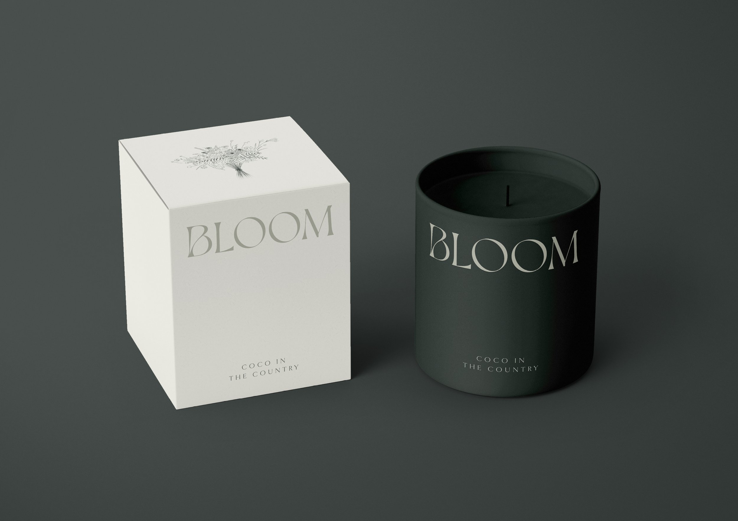
This project was about refinement, not reinvention.
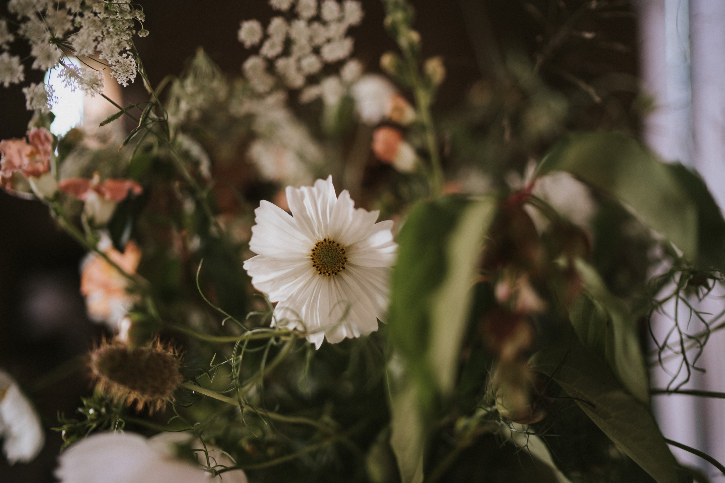
Lucy and Kim already had a distinctive voice in their work... natural, expressive, emotionally attuned. The role of the brand wasn’t to add personality, but to create a setting where their artistry could be seen and felt without distraction. Everything became a question of balance. How do you elevate something without making it feel formal? How do you create prestige without losing warmth?
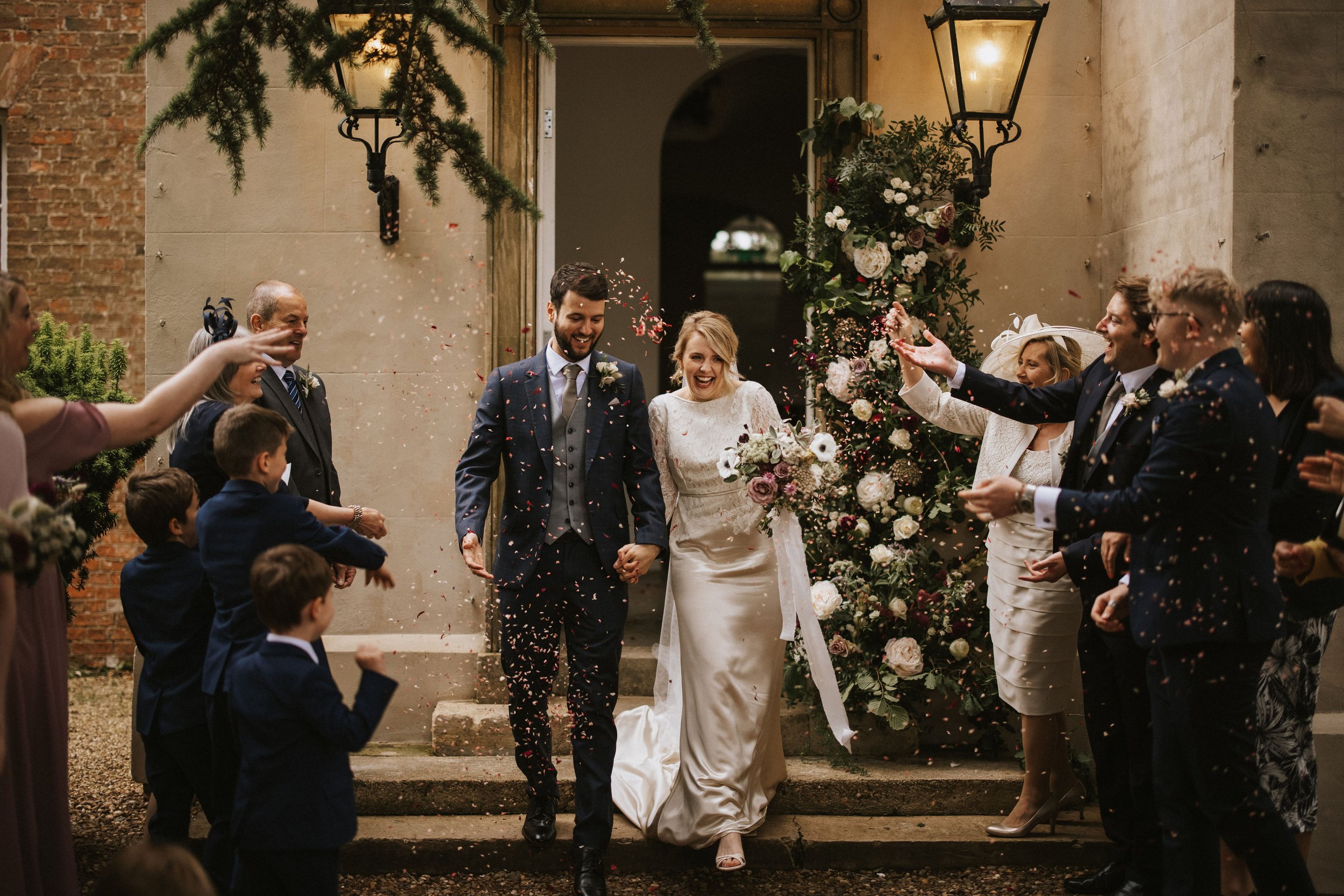
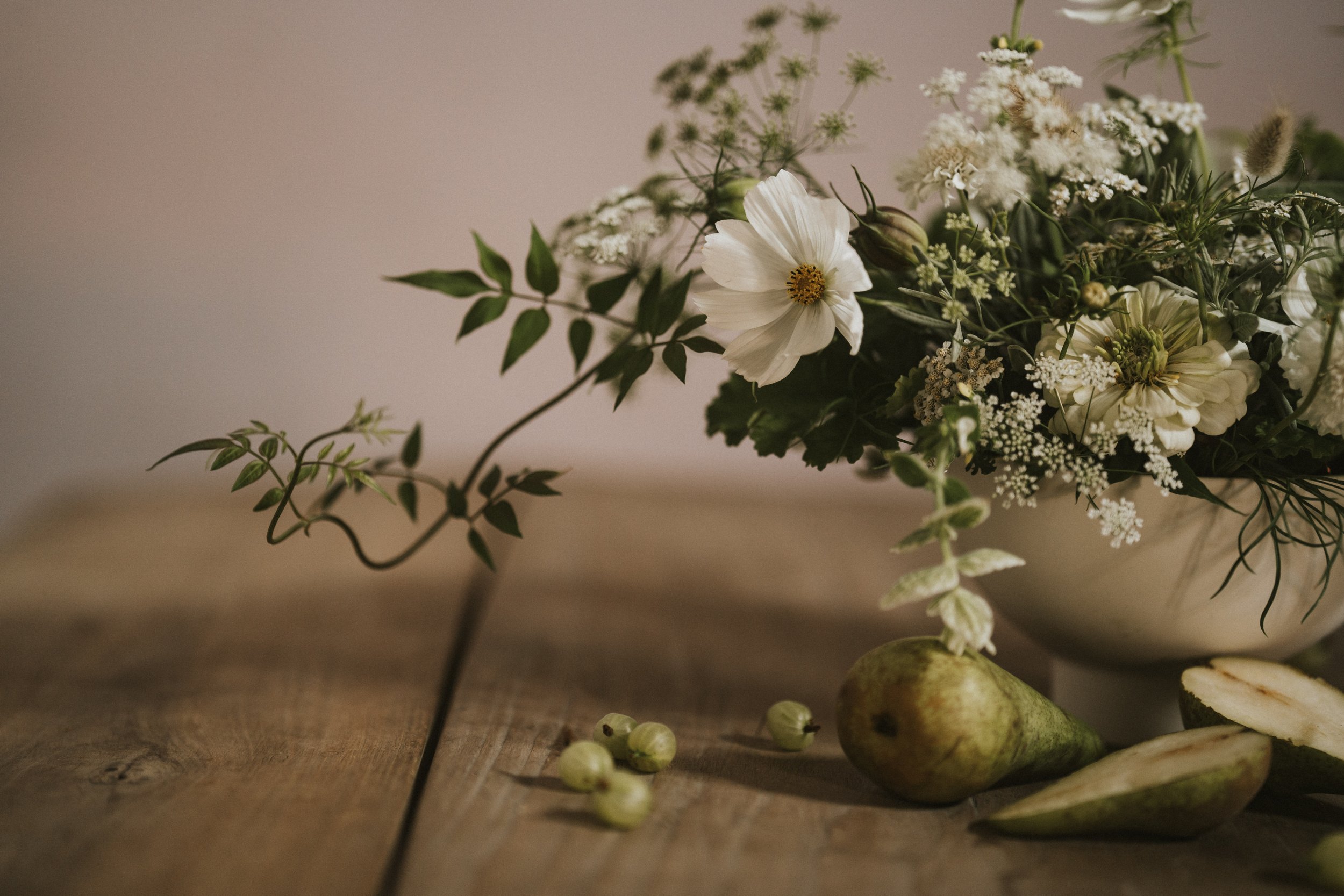
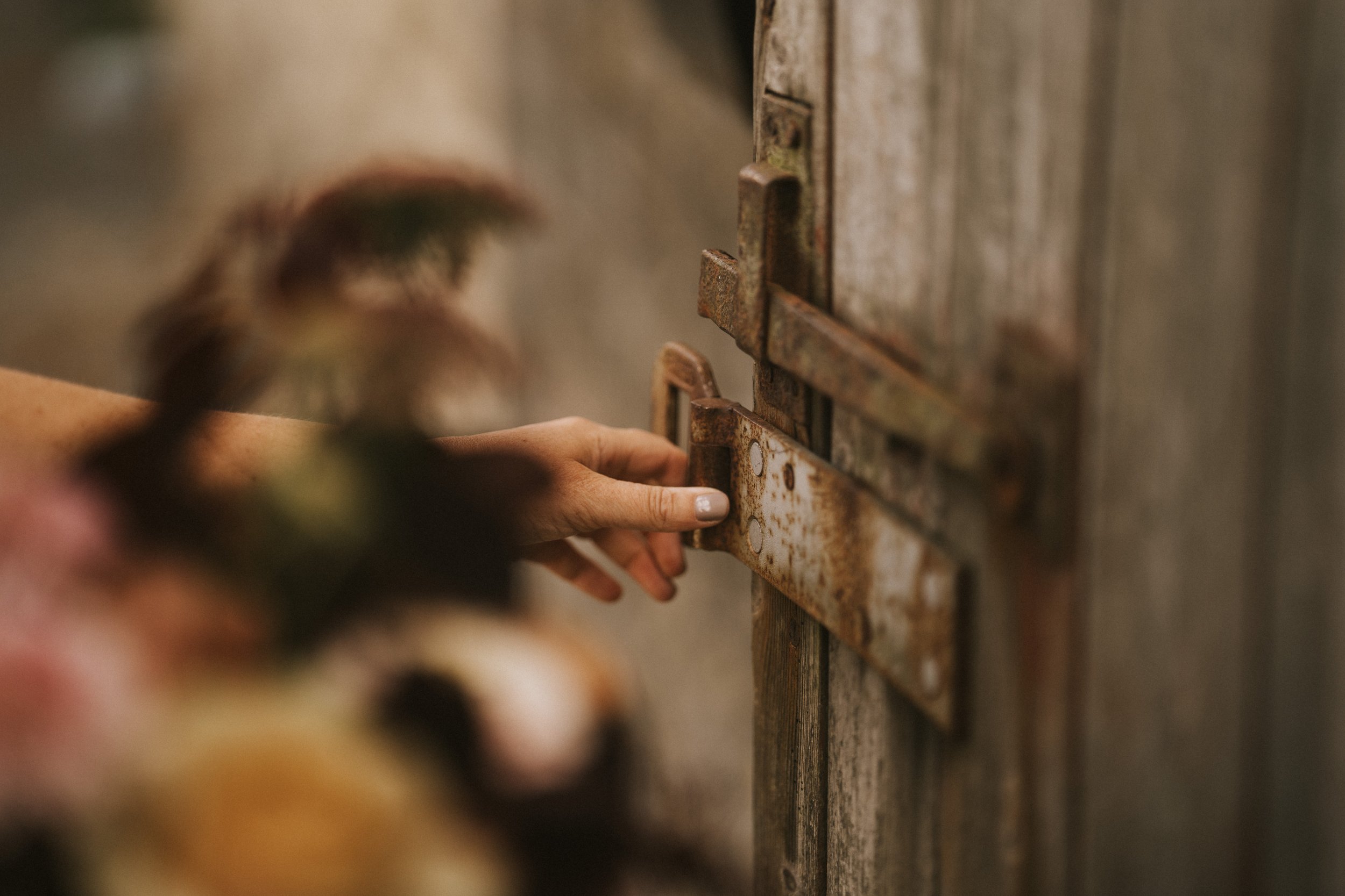
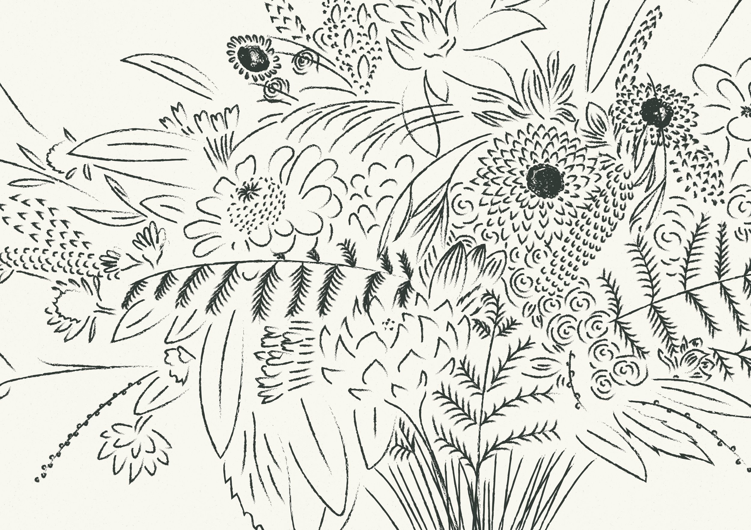
The design language leans into restraint. Softness in colour. Space in layout. Texture in materials. Nothing loud, nothing excessive... just a quiet confidence that allows their work to remain the focal point. The brand needed to feel as considered as the way they place a stem, as intentional as the atmosphere they create at an event.
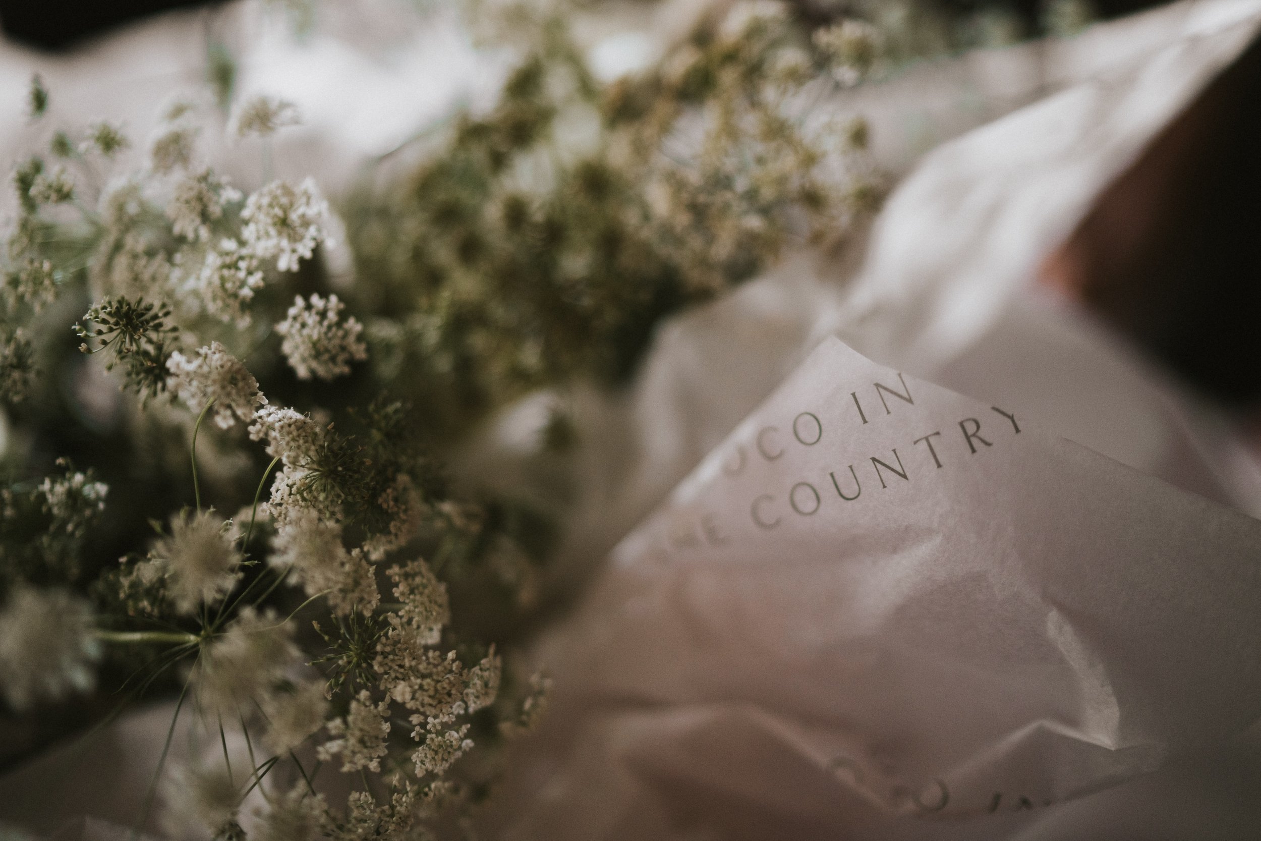
Beyond the visuals, this was about experience. Every touchpoint, from printed materials to the website, was designed to mirror how they make their clients feel: held, guided, reassured. The identity doesn’t perform. It supports. It creates calm, clarity and a sense of trust before a single flower is even seen in person.
This project sits in the space where beauty meets sensitivity. A reminder that design can be both elevated and deeply human — structured enough to hold a business, gentle enough to carry emotion.