Lucy came to this project at a point of artistic expansion.
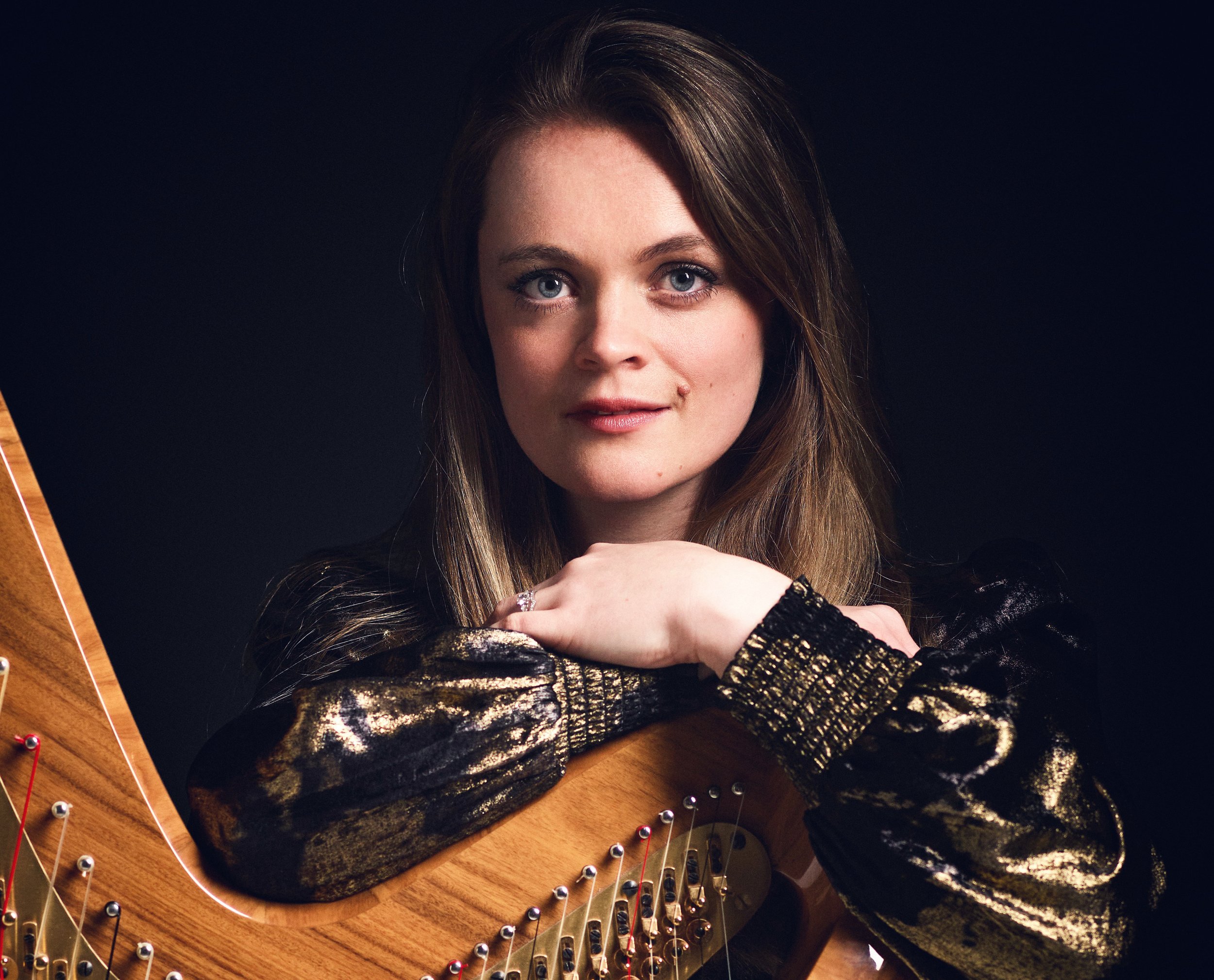
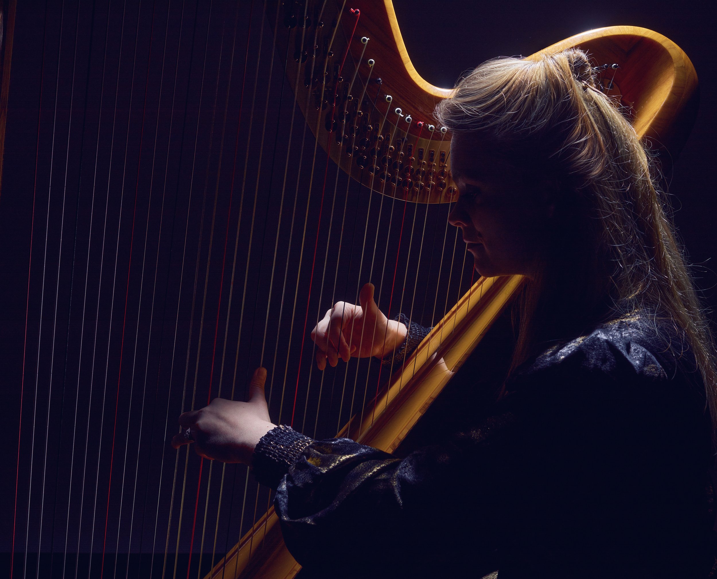
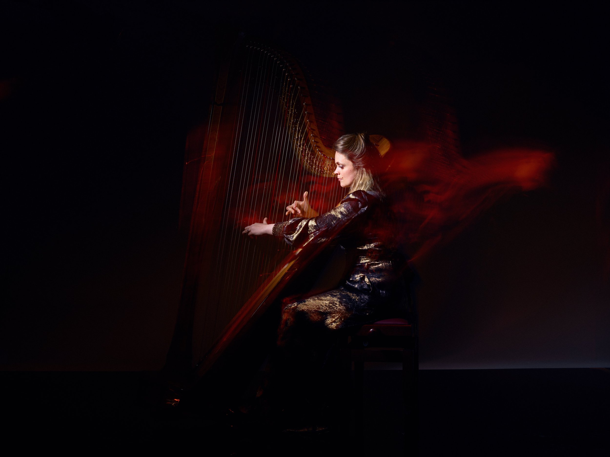
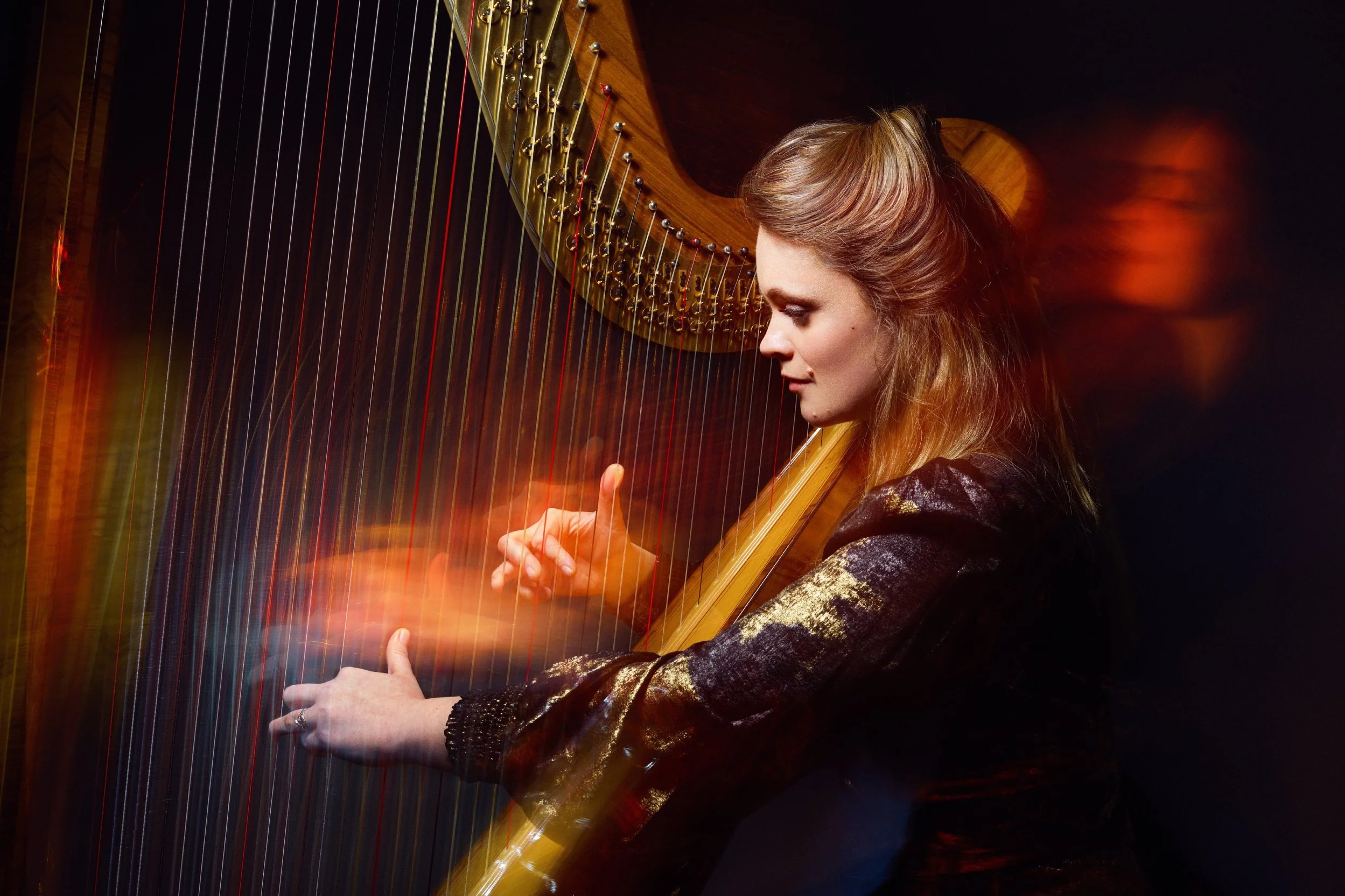
Her work had grown beyond the expectations often placed on her instrument. She was performing in concert halls, collaborating across genres, and moving between classical, contemporary, and experimental spaces... yet her visual identity still spoke to a narrower, more traditional perception of what a harpist “is”.
The task here wasn’t reinvention. It was alignment.
This project was about creating a presence that matched the scale, precision, and expressiveness of Lucy’s musicianship. The identity balances strength and openness... bold typography and dramatic contrast paired with space and restraint. That tension mirrors the harp itself: an instrument that is both delicate and powerful, architectural and fluid.
Language, imagery, and structure all played a role in shifting perception. Small but deliberate choices reframed her positioning, not away from approachability, but toward artistic authority. The result is a brand that gives Lucy room to inhabit the full breadth of her work, from solo recitals to collaborative projects, without feeling confined to one narrative.
What I value most in this project is its sense of proportion. Nothing shouts, but everything holds presence. The brand doesn’t try to compete with her artistry. It supports it, framing the work with clarity and quiet confidence.